IDENITITY
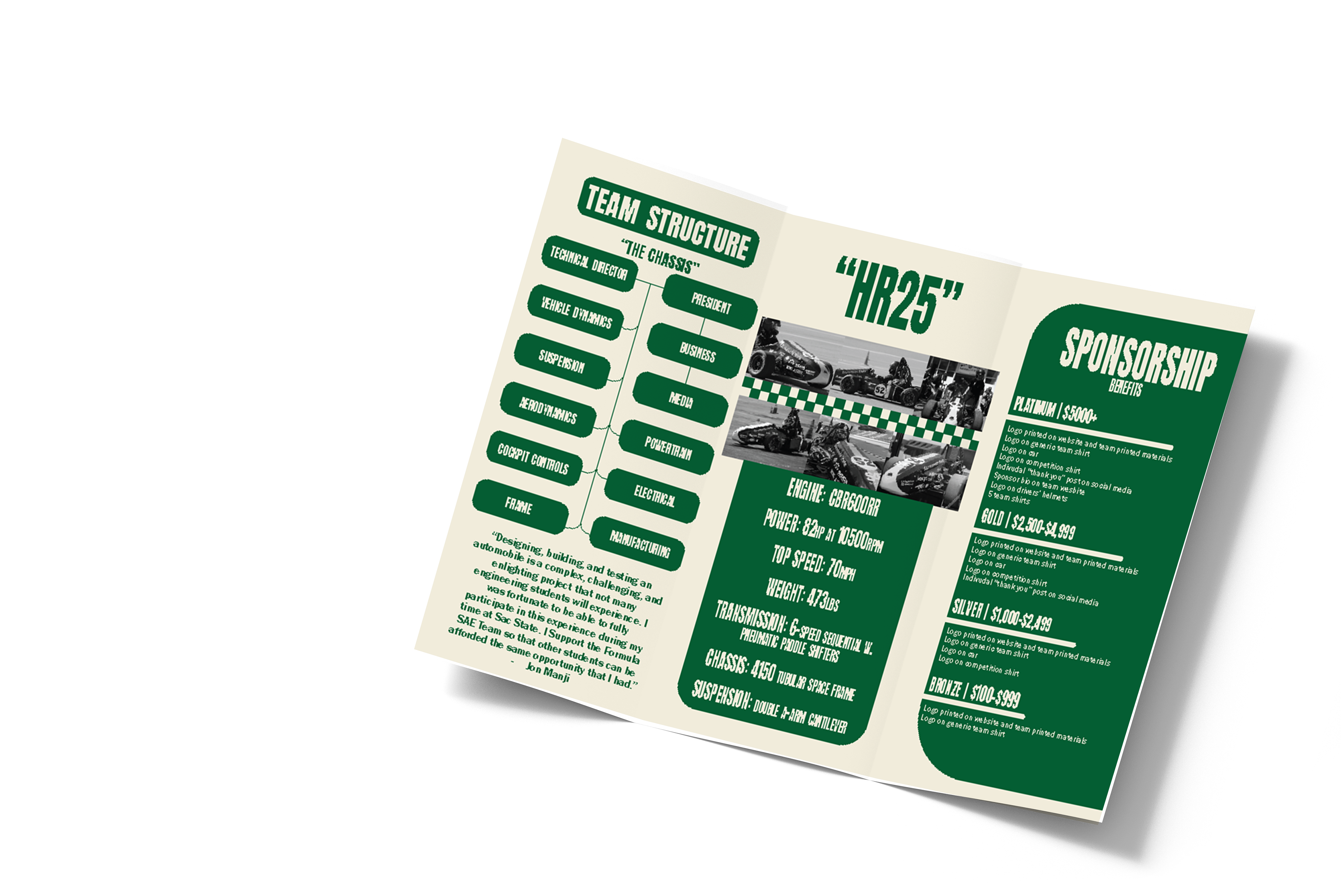
Sponsorship Pamphlet
Creating this pamphlet required balancing visual identity with clear technical communication. The goal was to present Hornet Racing’s brand through our established colors while organizing detailed information about each subsystem in a way that remained accessible to potential sponsors.
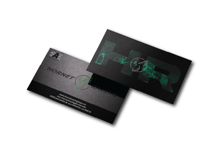
Business Cards
Designing business cards for Hornet Racing focused on translating the team’s identity into a compact, functional format. The goal was to create a design that felt professional and memorable while staying consistent with the team’s established branding. One of the main challenges was working within the limited space of a business card while ensuring key information remained clear and visually balanced
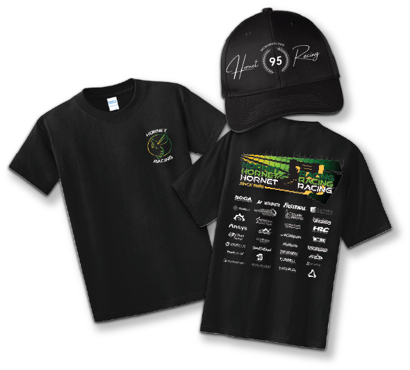
Merchandise
Designing this year’s merchandise for Hornet Racing focused on evolving the team’s visual identity while maintaining brand recognition. In collaboration with Katherine Robles, we introduced yellow as a new accent color and expanded the product line to include hats, something the team hadn't offered in a few years.
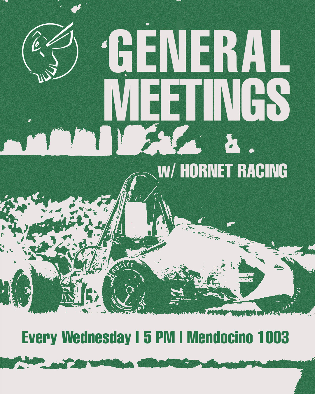
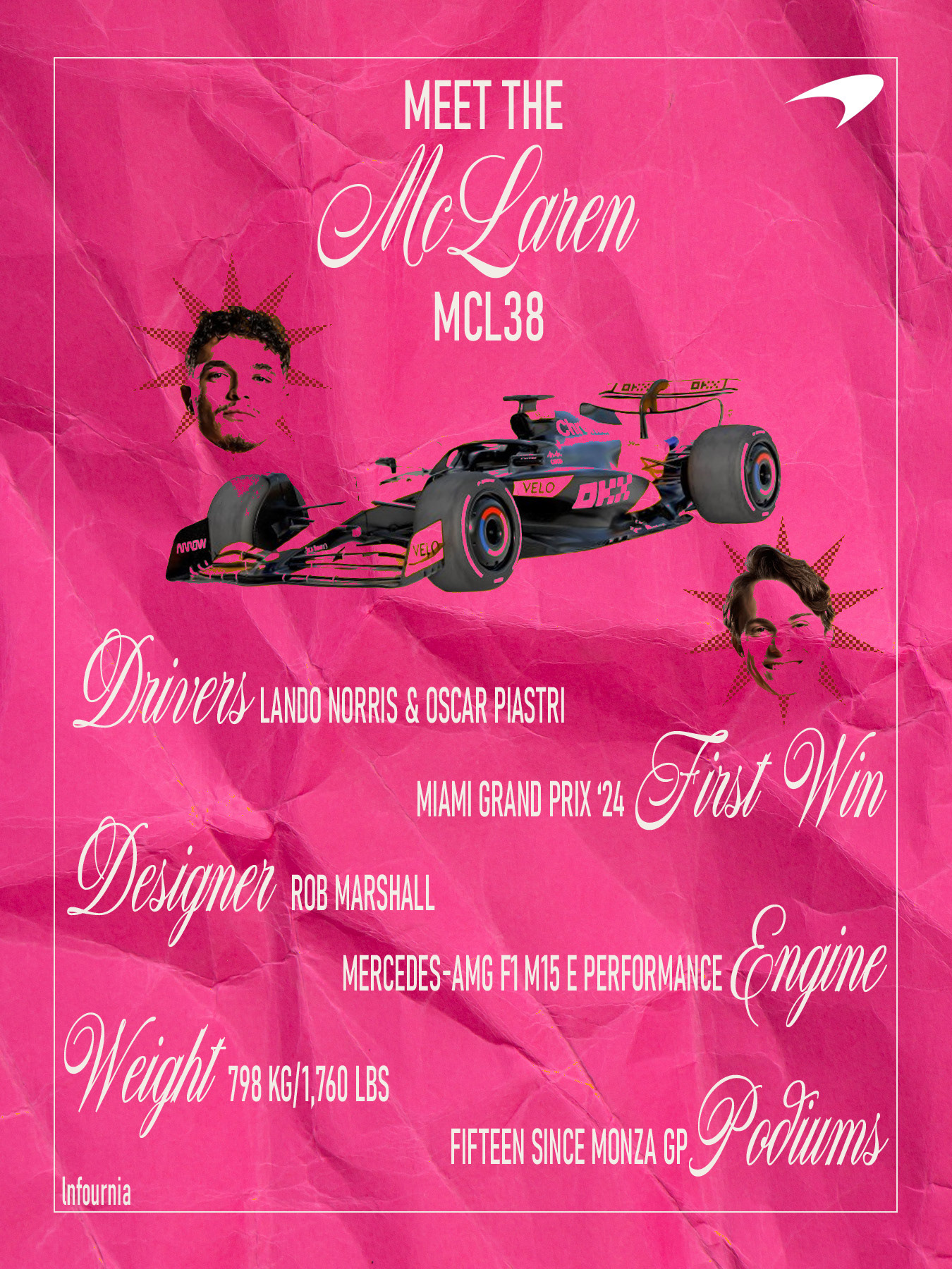
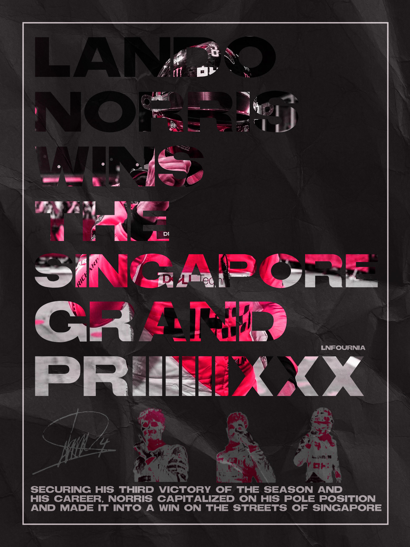
MOTORSPORTS
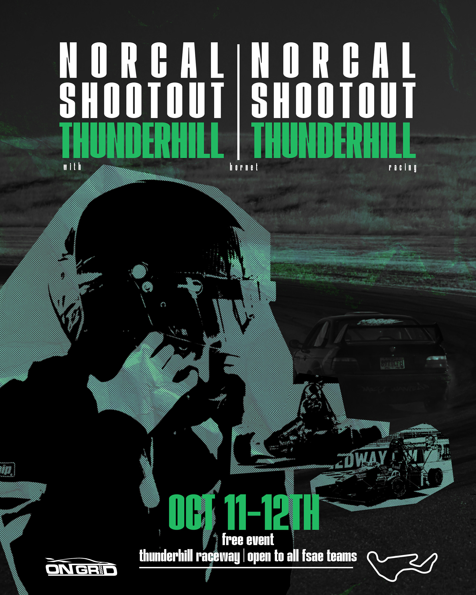
NorCal Shootout
Designing a flyer for FSAE’s first NorCal Shootout.
This event was planned and organized by Hornet Racing’s Technical Director, Celia Lenear. Working side by side with her on this project was very fun and full of creativity. Finding a way to represent our team but being inclusive to other attending teams was one of the challeneges faced.
This event was planned and organized by Hornet Racing’s Technical Director, Celia Lenear. Working side by side with her on this project was very fun and full of creativity. Finding a way to represent our team but being inclusive to other attending teams was one of the challeneges faced.
.
.
.
.
insert here
.
insert here
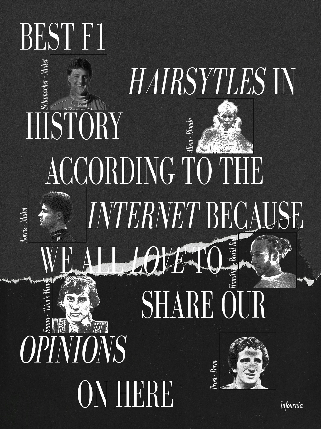
MUSIC GRAPHICS
.
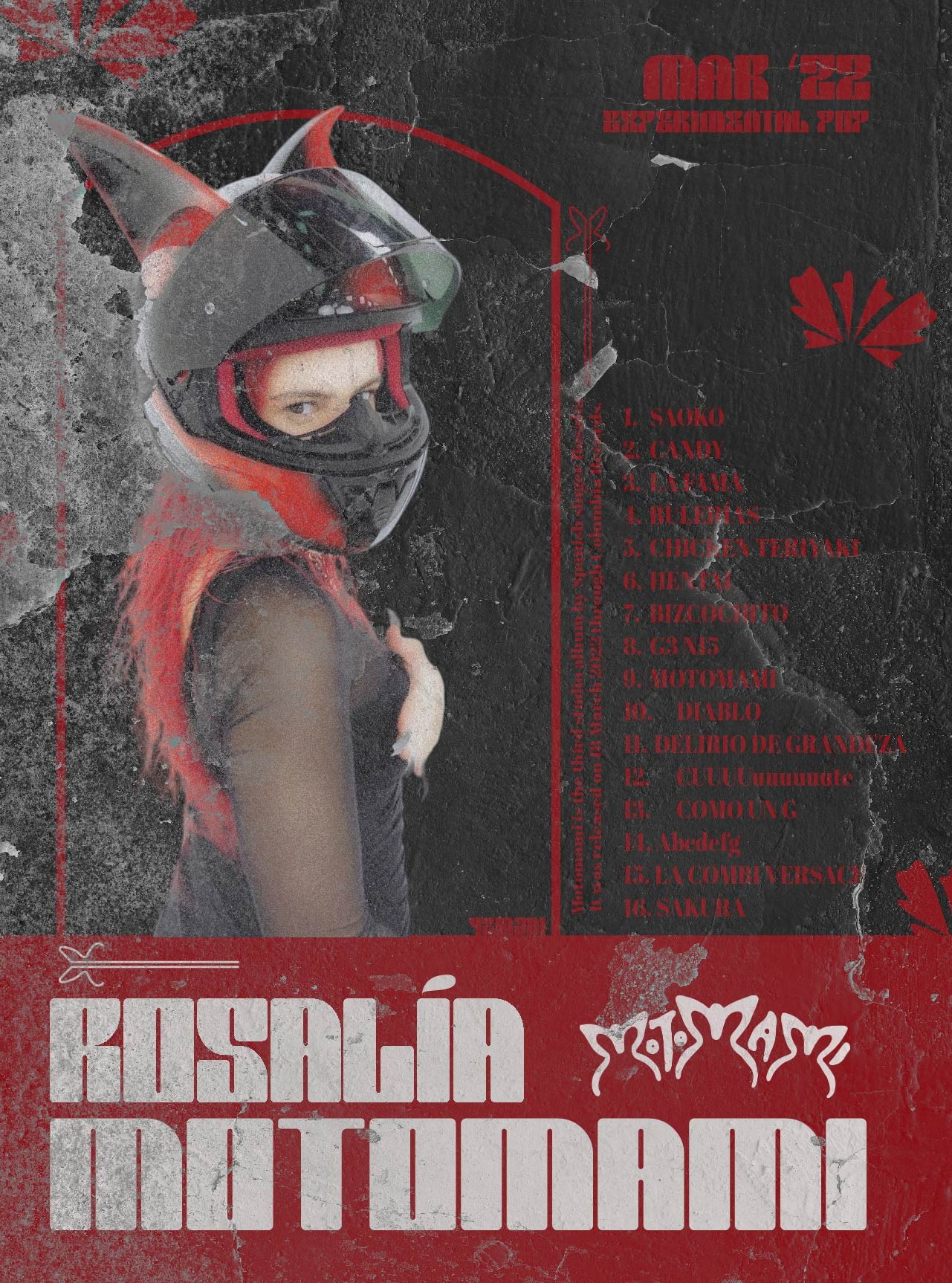
.
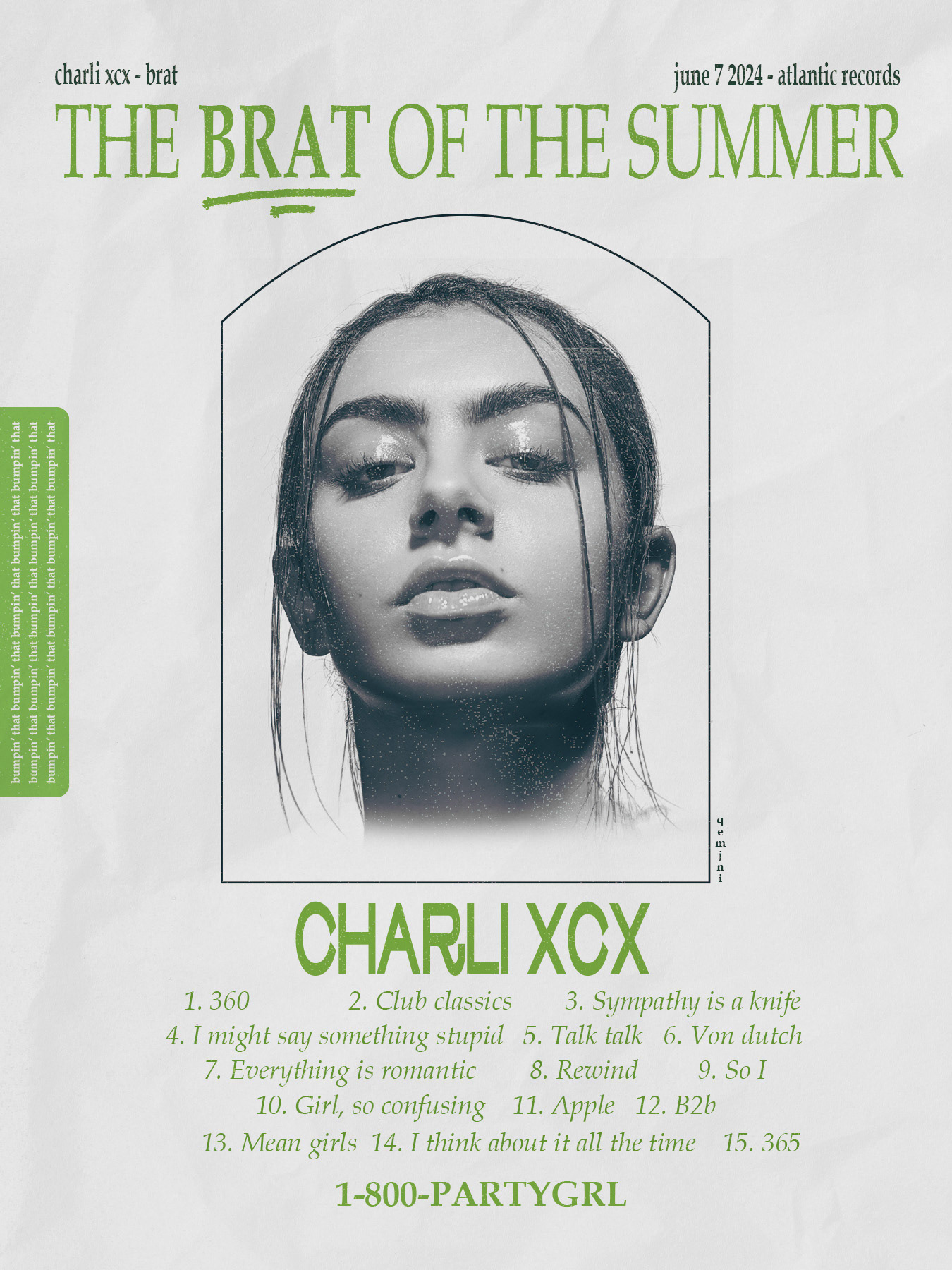
.
.
OTHERS
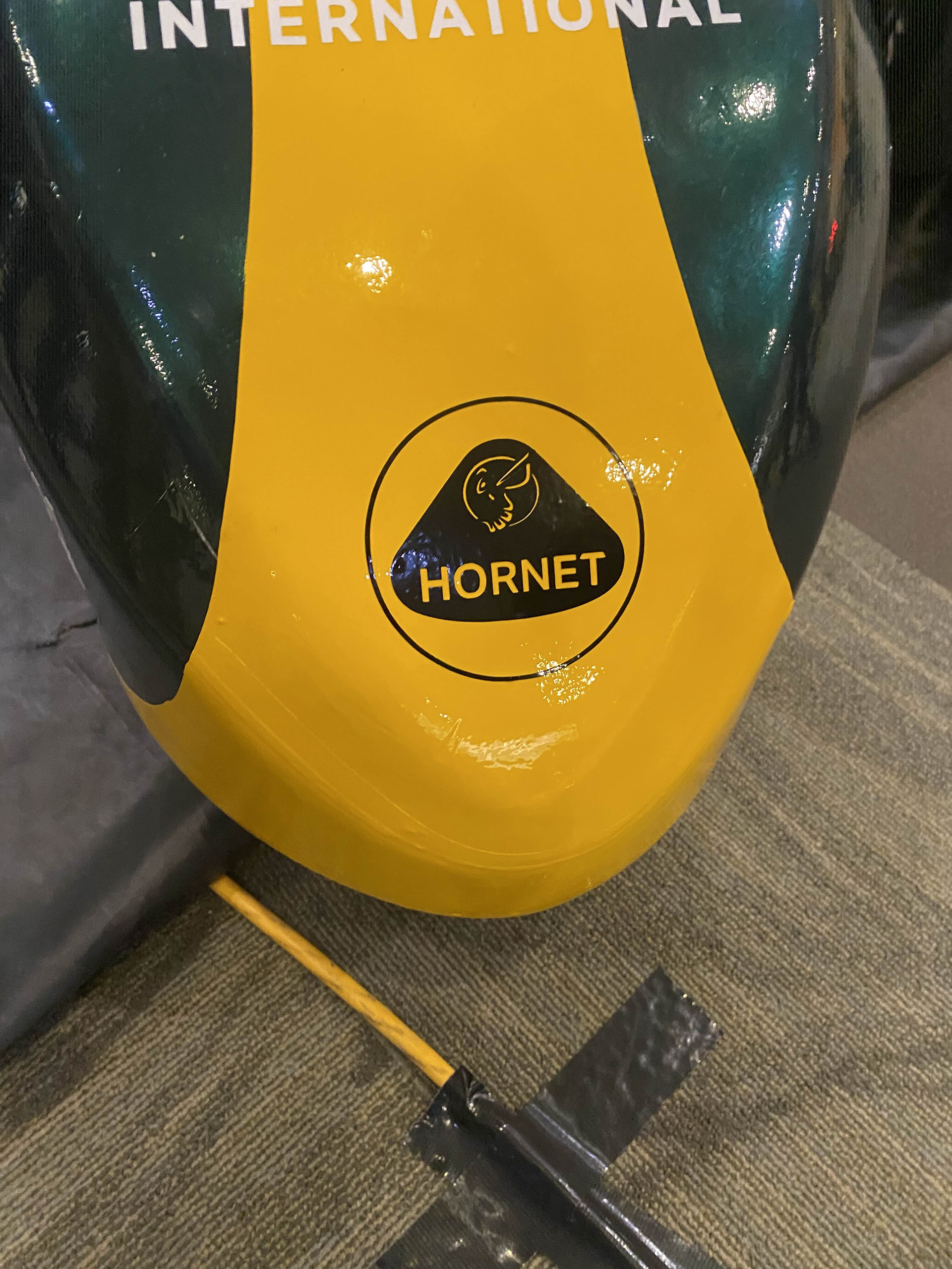
Livery
Inspired by the iconic Lotus 49, this project focused on developing Hornet Racing’s 2025 livery in celebration of the team’s 30-year anniversary. My role was to design a logo that mixed Lotus’ historic yellow with the team's identity. One of the main challenges was balancing inspiration with originality, referencing a well-known design while ensuring the final result remained distinctly representative of Hornet Racing.
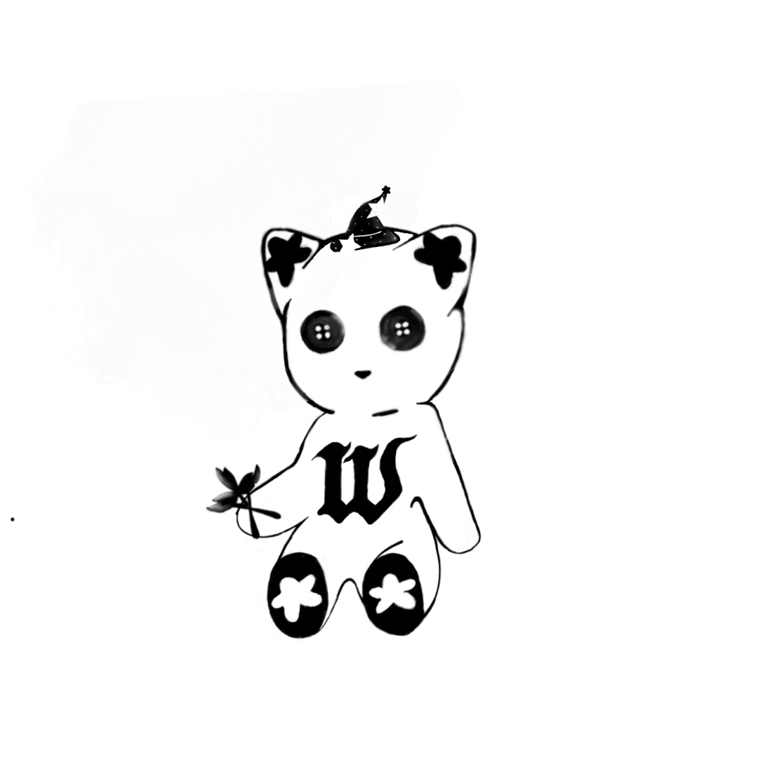
WHYBORNE Logo
Musical artist, WHYBORNE, draws inspiration from Henry Selick's iconic Coraline, finding his artistic stride through spiritual exploration. Desiring a logo evoking witchcraft and childhood nostalgia, I designed a logo that embodied teddy bear holding these elements. With button eyes reminiscent of Coraline's eerie charm, the design captures a blend of unsettling yet nostalgic undertones.
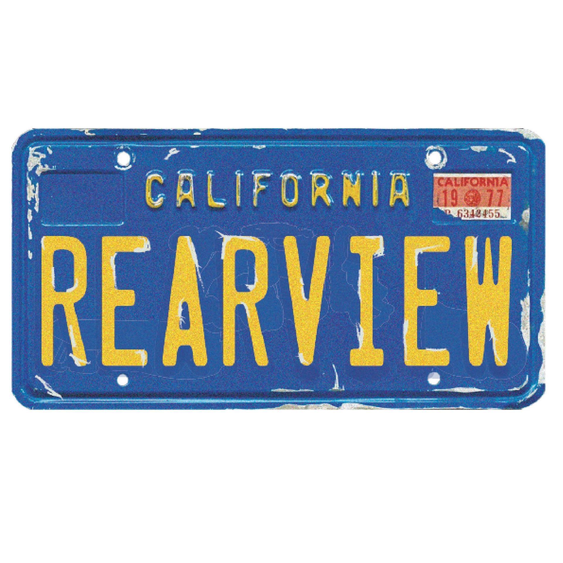
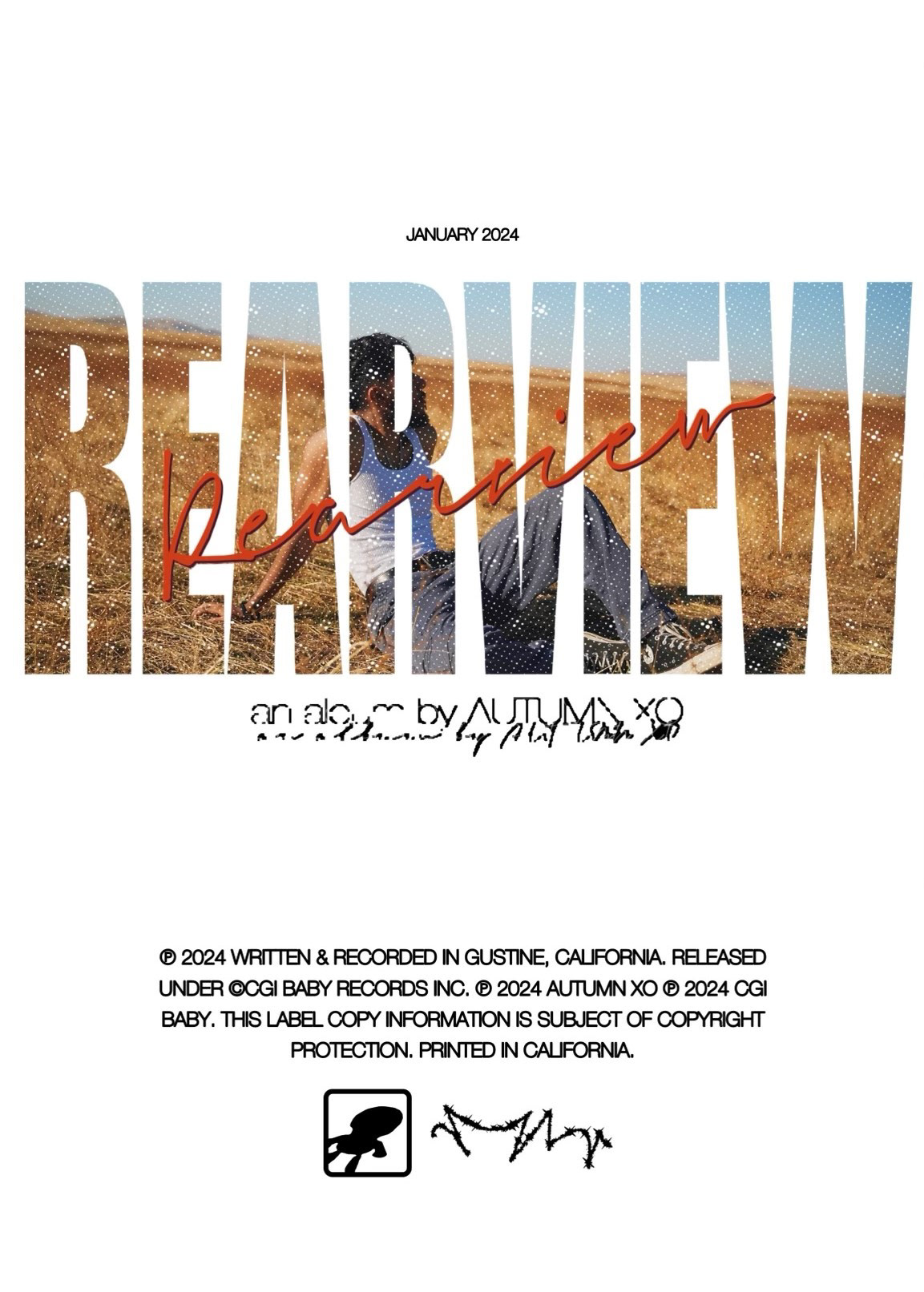
AUTUMN XO Logo
Drawing inspiration from his native California and personal experiences with mental health, AUTUMN XO is embracing change. 'REARVIEW,' his upcoming duo album, alongside 'CALIFORNIA,' set for release this summer, collectively titled 'REARVIEW CALIFORNIA,' marks a significant new chapter.